What is Channel Charting?
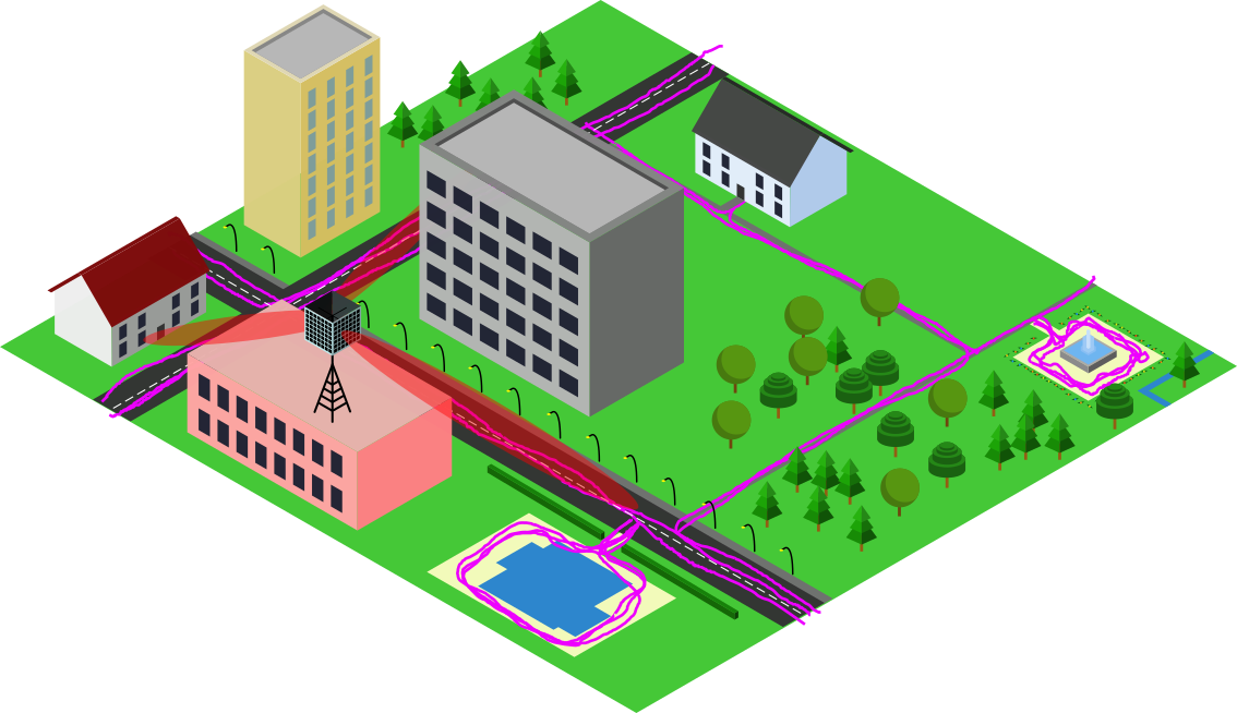
Thanks to global navigation satellite systems, your phone can tell you your location and reliably guide you to your destiation. Well, except if you are indoors or in an urban canyon of course, then you are on your own. And, sure it will drain your battery a bit faster. It will also take a few moments until your phone has picked up signals from sufficiently many satellites to localize you. Is this really the best technology can do?
We believe that, by leveraging future massive MIMO deployments in 5G and beyond in a process known as "Channel Charting", there is still room for enhancing geolocation services. Massive MIMO is a crucial technology for improving the spectral efficiency of wireless telecommunication systems through spatial multiplexing and will likely be deployed in the form of 5G base stations. With massive MIMO, the base station collects so-called channel state information (CSI) at every receiver antenna, from which the base station can infer properties like angles of arrival, reflections and propagation delays. While this is essential for ensuring the functionality of massive MIMO, CSI does not necessarily have to be stored and analyzed. But, what if we did just that, can we localize end users at the base station just from CSI? Well, sure! It has been shown that CSI-based user localization is possible (we have a tutorial on that!), at least with supervised machine learning methods such as CSI fingerprinting. These approaches, however, require "ground truth" position labels for the transmitter position, which are usually not available. Channel Charting, on the other hand, is a self-supervised learning technique which aims to create a virtual map of high-dimensional CSI. Therefore, Channel Charting is not dependent on the availability of position labels, which is a huge advantage over fingerprinting.
While faster and more reliable personal navigation will be the most visible advantage for end users, asset tracking and radio access network (RAN) management tasks will benefit even more significantly: Asset tracking, because embedding GNSS (e.g., GPS) receivers into trackers is often infeasible: A GNSS receiver is more expensive than just a wide-area radio modem, it doesn't work inside warehouses and needs a lot of energy and hence does not last on a battery for long (especially if the device is usually in sleep mode, and needs up to a minute to obtain an accurate position estimate after waking up before going back to sleep). The mobile network itself will also benefit significantly from the availability of location information at the base station. For example, knowing location and velocity of a user will allow the base station to predict the wireless channel into the future. In addition, the network will be able to plan handovers between base stations ahead of time ensuring seamless connectivity and prevent pilot contamination.
TL;DR - Video
DICHASUS Datasets for Channel Charting
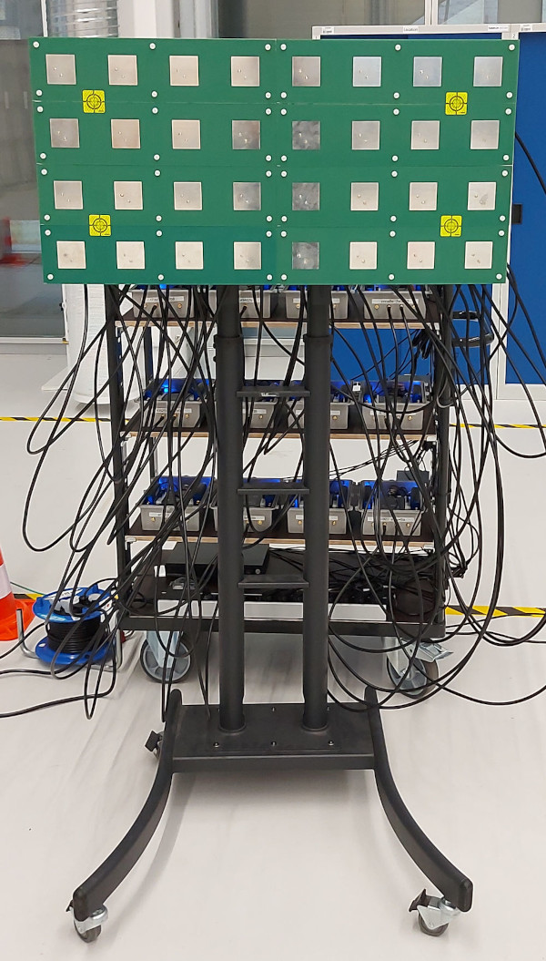
DICHASUS is not a "real" base station, but we can use channel sounder data to investigate the feasibility of Channel Charting in a real-world setup. The datasets are particularly suitable for Channel Charting research for several reasons:
- Large datasets: Channel Charting needs lots of training data
- Distributed massive MIMO: Channel Charting works better if there are several distributed, yet coherent antenna arrays. Want to test it with just one massive MIMO array? Just remove the others from the training set.
- Real-world scenarios: If your algorithm works with DICHASUS datasets, you can show that it works in the real world (and not only in a simulator). The carrier frequency ranges that DICHASUS uses are close to the frequency range of real-world 4G/5G networks, so the chance that results will be reproducible on real distributed massive MIMO base stations is high.
- Accurate "ground truth" positions: Since Channel Charting is unsupervised, you don't need these for training, but they are necessary for performance evaluations.
Overview: Dissimilarity Metric-Based Channel Charting

What we call dissimilarity metric-based Channel Charting is a very structured way to perform Channel Charting on a measured dataset. The basic idea is that we will compute pseudo-distances that we call dissimilarities between pairs of datapoints in the dataset. We will discuss later how exactly that works, but basically, you can extract information about distances either from metadata (like timestamps) or directly from CSI - in this tutorial, we will combine ("fuse") both sources of information. These distances are then collected in a large matrix that we call the dissimilarity matrix.
Next, classical or deep learning-based manifold learning techniques are applied to learn a low-dimensional representation. In contrast to other Channel Charting techniques (e.g., our timestamp/triplet-based tutorial), we don't really need a neural network, but using one has some advantages over classical methods (more on that later).
Downloading and Reading the CSI Dataset
For this tutorial, we use the dichasus-cf0x dataset collected by DICHASUS.
This dataset contains CSI for \(BM = 32\) receive antennas (\( B=4 \) antenna arrays with \( M = 8 \) antennas per array) and for \( N_\mathrm{sub} = 1024 \) OFDM subcarriers at \( L \) different transmitter positions ("datapoints").
The transmitter is mounted on top of a robot, which follows some trajectory through the measurement area.
The CSI at a particular time instant can be expressed as a matrix \(\mathbf H^{(l)} \in \mathbb C^{BM \times N_\mathrm{sub}}\).
Hence, the dataset consists of datapoints that are 3-tuples of channel coefficients \( \mathbf{H}^{(l)} \in \mathbb C^{BM \times N_\mathrm{sub}} \), ground truth positions \( \mathbf{x}^{(l)} \in \mathbb{R}^2 \) and timestamps \( t^{(l)} \in \mathbb R \):
\[
\text{Dataset:} \quad \left\{ (\mathbf{H}^{(l)}, \mathbf x^{(l)}, t^{(l)}) \right\}_{l = 1, \ldots, L}
\]
The ground truth positions (which are really only for evaluation purposes, they are not used for training!) are measured with a tachymeter robotic total station, a very precise instrument that tracks the robot's antenna with a laser with at least centimeter-level accuracy.
DICHASUS uses a reference transmitter for synchronization, which entails that measured phases may exhibit constant offsets caused by the specific channel between reference transmitter and receive antenna.
Luckily, we computed these offsets for each DICHASUS dataset and made them available for download.
The datasets themselves are provided in the TFRecords file format, which makes loading them with TensorFlow particularly simple.
Obviously, the more training data we have, the better the channel chart gets.
To save some disk and RAM space, we will settle for just 3 robot round trips in the following: dichasus-cf02.tfrecords, dichasus-cf03.tfrecords and dichasus-cf04.tfrecords:
# Use the following commands to download parts of the dichasus-cf0x dataset.
# This tutorial uses the "old" dataset version (not "rev2") - do not manually download the dataset from the website.
# If you need to manually download the dataset from your browser, please use this website instead:
# https://darus.uni-stuttgart.de/dataset.xhtml?persistentId=doi:10.18419/DARUS-2854&version=2.0
!mkdir dichasus
!wget -nc --content-disposition https://darus.uni-stuttgart.de/api/access/datafile/:persistentId?persistentId=doi:10.18419/darus-2854/8 -P dichasus # dichasus-cf02
!wget -nc --content-disposition https://darus.uni-stuttgart.de/api/access/datafile/:persistentId?persistentId=doi:10.18419/darus-2854/9 -P dichasus # dichasus-cf03
!wget -nc --content-disposition https://darus.uni-stuttgart.de/api/access/datafile/:persistentId?persistentId=doi:10.18419/darus-2854/10 -P dichasus # dichasus-cf04
!wget -nc https://dichasus.inue.uni-stuttgart.de/datasets/data/dichasus-cf0x/reftx-offsets-dichasus-cf02.json -P dichasus
!wget -nc https://dichasus.inue.uni-stuttgart.de/datasets/data/dichasus-cf0x/reftx-offsets-dichasus-cf03.json -P dichasus
!wget -nc https://dichasus.inue.uni-stuttgart.de/datasets/data/dichasus-cf0x/reftx-offsets-dichasus-cf04.json -P dichasus
Next, we load the TFRecords files with TensorFlow:
from sklearn.neighbors import NearestNeighbors, kneighbors_graph
from sklearn.manifold import trustworthiness
from scipy.sparse.csgraph import dijkstra
from scipy.spatial import distance_matrix
from sklearn.manifold import MDS
import matplotlib.pyplot as plt
import multiprocessing as mp
from tqdm.auto import tqdm
import tensorflow as tf
import numpy as np
import random
import queue
import json


# Antenna definitions
ASSIGNMENTS = [
	[0, 13, 31, 29, 3, 7, 1, 12 ],
	[30, 26, 21, 25, 24, 8, 22, 15],
	[28, 5, 10, 14, 6, 2, 16, 18],
	[19, 4, 23, 17, 20, 11, 9, 27]
]

ANTENNACOUNT = np.sum([len(antennaArray) for antennaArray in ASSIGNMENTS])

def load_calibrate_timedomain(path, offset_path):
	offsets = None
	with open(offset_path, "r") as offsetfile:
		offsets = json.load(offsetfile)

	def record_parse_function(proto):
		record = tf.io.parse_single_example(
			proto,
			{
				"csi": tf.io.FixedLenFeature([], tf.string, default_value=""),
				"pos-tachy": tf.io.FixedLenFeature([], tf.string, default_value=""),
				"time": tf.io.FixedLenFeature([], tf.float32, default_value=0),
			},
		)

		csi = tf.ensure_shape(tf.io.parse_tensor(record["csi"], out_type=tf.float32), (ANTENNACOUNT, 1024, 2))
		csi = tf.complex(csi[:, :, 0], csi[:, :, 1])
		csi = tf.signal.fftshift(csi, axes=1)

		position = tf.ensure_shape(tf.io.parse_tensor(record["pos-tachy"], out_type=tf.float64), (3))
		time = tf.ensure_shape(record["time"], ())

		return csi, position[:2], time

	def apply_calibration(csi, pos, time):
		sto_offset = tf.tensordot(tf.constant(offsets["sto"]), 2 * np.pi * tf.range(tf.shape(csi)[1], dtype = np.float32) / tf.cast(tf.shape(csi)[1], np.float32), axes = 0)
		cpo_offset = tf.tensordot(tf.constant(offsets["cpo"]), tf.ones(tf.shape(csi)[1], dtype = np.float32), axes = 0)
		csi = tf.multiply(csi, tf.exp(tf.complex(0.0, sto_offset + cpo_offset)))

		return csi, pos, time

	def csi_time_domain(csi, pos, time):
		csi = tf.signal.fftshift(tf.signal.ifft(tf.signal.fftshift(csi, axes=1)),axes=1)

		return csi, pos, time

	def cut_out_taps(tap_start, tap_stop):
		def cut_out_taps_func(csi, pos, time):
			return csi[:,tap_start:tap_stop], pos, time

		return cut_out_taps_func

	def order_by_antenna_assignments(csi, pos, time):
		csi = tf.stack([tf.gather(csi, antenna_inidces) for antenna_inidces in ASSIGNMENTS])
		return csi, pos, time

	dataset = tf.data.TFRecordDataset(path)

	dataset = dataset.map(record_parse_function, num_parallel_calls = tf.data.AUTOTUNE)
	dataset = dataset.map(apply_calibration, num_parallel_calls = tf.data.AUTOTUNE)
	dataset = dataset.map(csi_time_domain, num_parallel_calls = tf.data.AUTOTUNE)
	dataset = dataset.map(cut_out_taps(507, 520), num_parallel_calls = tf.data.AUTOTUNE)
	dataset = dataset.map(order_by_antenna_assignments, num_parallel_calls = tf.data.AUTOTUNE)

	return dataset

inputpaths = [
	{
		"tfrecords" : "dichasus/dichasus-cf02.tfrecords",
		"offsets" : "dichasus/reftx-offsets-dichasus-cf02.json"
	},
	{
		"tfrecords" : "dichasus/dichasus-cf03.tfrecords",
		"offsets" : "dichasus/reftx-offsets-dichasus-cf03.json"
	},
	{
		"tfrecords" : "dichasus/dichasus-cf04.tfrecords",
		"offsets" : "dichasus/reftx-offsets-dichasus-cf04.json"
	}
]

full_dataset = load_calibrate_timedomain(inputpaths[0]["tfrecords"], inputpaths[0]["offsets"])

for path in inputpaths[1:]:
	full_dataset = full_dataset.concatenate(load_calibrate_timedomain(path["tfrecords"], path["offsets"]))
There is quite a lot to unwrap in that dataset loading code, so here is a short summary:
We load all three TFRecord files (dichasus-cf02, dichasus-cf03, dichasus-cf04), and each of them goes through a pipeline of processing steps:
-
First,
record_parse_functionreads the raw.tfrecordfile and extracts frequency-domain CSI, "ground truth" position information and timestamps. Afterwards, the complex-valued tensorcsishould have shape(32, 1024), where \( BM = 32 \) is the number of antennas and \( N_\mathrm{sub} = 1024 \) is the number of subcarriers. Each entry corresponds to the channel coefficient of one particular OFDM subchannel. - Second, we use
apply_calibrationto correct time and phase errors as explained in the calibration tutorial. - Third,
csi_time_domaincomputes the inverse fast fourier transform (IFFT) of the frequency-domain CSI (over the subcarrier axis) so that the variablecsinow contains complex-valued time domain channel impulse responses of length 1024 taps. -
Fourth,
cut_out_tapsextracts time-domain taps \( \tau_\mathrm{min} = 507 \) to \( \tau_\mathrm{max} = 520 \), which should contain the line of sight signal as well as most relevant reflections and discards the rest. Thecsitensor now has shape(32, 13), i.e., we have 13 taps for each of the 32 antennas in the setup. -
Finally,
order_by_antenna_assignmentsadds another dimension to the shape of thecsitensor such that measurements are grouped by antenna array. It returns acsitensor with shape(4, 8, 13), where \( B = 4 \) corresponds to the number of antenna arrays, \( M = 8 \) is the number of antennas per array and \( \tau_\mathrm{max} - \tau_\mathrm{min} = 13 \) is still the number of time-domain taps.
At the output of the processing pipeline, we get time-domain CSI tensors \( \mathbf { \hat H^{(l)} } \in \mathbb C^{B \times M \times (\tau_\mathrm{max} - \tau_\mathrm{min})} \). In all subsequent steps, we will work with these time-domain tensors. The superscript \( l \) of \( \mathbf { \hat H^{(l)} } \) indicates the datapoint, and we will use comma-separated subscripts for indexing.
To reduce the number of datapoints (and hence, RAM usage and processing time), we will only use every 4th datapoint:# Decimate dataset: Use only every 4th datapoint (to reduce number of points)
training_set = full_dataset.shard(4, 0)From TensorFlow to NumPy
groundtruth_positions = []
csi_time_domain = []
timestamps = []

for csi, pos, time in training_set.batch(1000):
	csi_time_domain.append(csi.numpy())
	groundtruth_positions.append(pos.numpy())
	timestamps.append(time.numpy())

csi_time_domain = np.concatenate(csi_time_domain)
groundtruth_positions = np.concatenate(groundtruth_positions)
timestamps = np.concatenate(timestamps)
Visualizing the Dataset
We use theplot_colorized function to plot the ground truth positions in a top view diagram.
The function produces a scatter plot, where each point in the scatter plot is assigned a color according to its ground truth position.
We can later reuse this function to plot the channel chart with the same colorization.
def plot_colorized(positions, groundtruth_positions, title = None, show = True, alpha = 1.0):
	# Generate RGB colors for datapoints
	center_point = np.zeros(2, dtype = np.float32)
	center_point[0] = 0.5 * (np.min(groundtruth_positions[:, 0], axis = 0) + np.max(groundtruth_positions[:, 0], axis = 0))
	center_point[1] = 0.5 * (np.min(groundtruth_positions[:, 1], axis = 0) + np.max(groundtruth_positions[:, 1], axis = 0))
	NormalizeData = lambda in_data : (in_data - np.min(in_data)) / (np.max(in_data) - np.min(in_data))
	rgb_values = np.zeros((groundtruth_positions.shape[0], 3))
	rgb_values[:, 0] = 1 - 0.9 * NormalizeData(groundtruth_positions[:, 0])
	rgb_values[:, 1] = 0.8 * NormalizeData(np.square(np.linalg.norm(groundtruth_positions - center_point, axis=1)))
	rgb_values[:, 2] = 0.9 * NormalizeData(groundtruth_positions[:, 1])

	# Plot datapoints
	plt.figure(figsize=(6, 6))
	if title is not None:
		plt.title(title, fontsize=16)
	plt.scatter(positions[:, 0], positions[:, 1], c = rgb_values, alpha = alpha, s = 10, linewidths = 0)
	plt.xlabel("x coordinate")
	plt.ylabel("y coordinate")
	if show:
		plt.show()

plot_colorized(groundtruth_positions, groundtruth_positions, title="Ground Truth Positions")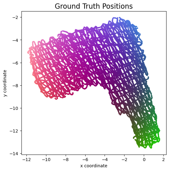
Introduction to the Dissimilarity Matrix
Brussels |
Paris |
Frankfurt |
Stuttgart |
Zürich |
|
|---|---|---|---|---|---|
| Brussels | 0 | 83 | 186 | ∞ | ∞ |
| Paris | 86 | 0 | 229 | 193 | 244 |
| Frankfurt | 189 | 238 | 0 | 77 | 233 |
| Stuttgart | ∞ | 190 | 78 | 0 | ∞ |
| Zürich | ∞ | 244 | 234 | ∞ | 0 |

In mathematical terms, the set of cities we considered can be viewed as the nodes of a graph, and the travel times between the cities can be interpreted as the edges of a directed graph. In this interpretation, the table above is the adjacency matrix of this graph, and this is essentially what we call the dissimilarity matrix \( \mathbf D \) in Channel Charting. In general, the dissimilarity matrix has \( N^2 \) entries, where \( N \) is the number of datapoints and, hence, nodes in the graph.
There are some general observations to be made about the dissimilarity matrix:
- The values in the matrix can be interpreted as pseudo-distances. They should be somewhat indicative of the true distance between points.
- The diagonal elements are zero.
- The matrix is either symmetric or almost symmetric. In the example above, it takes the same time to go from Paris to Zürich as it takes to get from Zürich to Paris, and the other entries differ by only a few minutes. For guessing the distances between cities, we can symmetrize the matrix as \( \mathbf D_\mathrm{sym} = \frac{1}{2} \left( \mathbf D + \mathbf D^\mathrm{T} \right) \).
Dissimilarity Metrics and Dissimilarity Matrix Computation

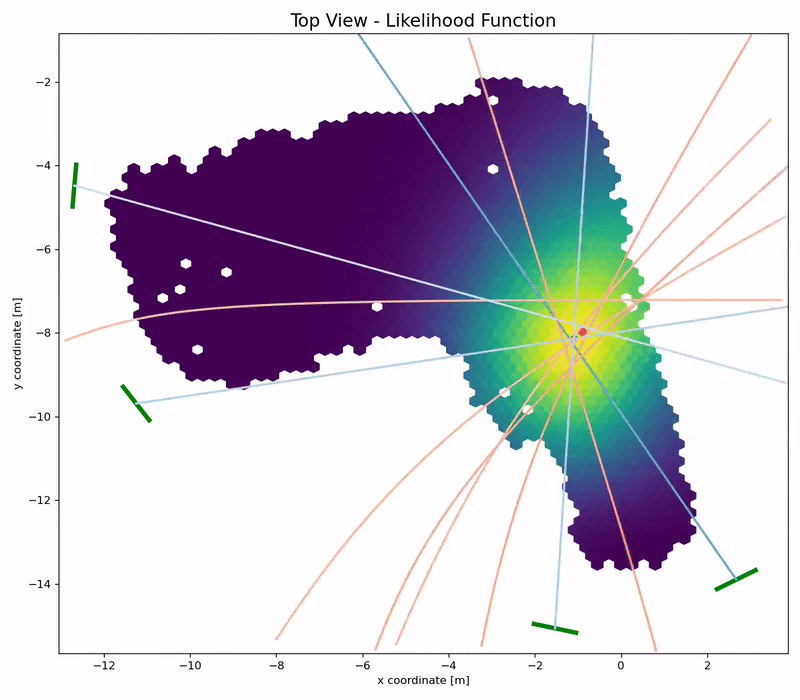
The picture above is taken from our paper on dissimilarity metric-based Channel Charting. It provides an overview over some of the ways in which dissimilarities between datapoints may be computed. On one hand, there are side information-based methods, like taking into account timestamps of measurements or by using some sort of ground truth information, where it is available (we would consider the latter to be cheating, we want a fully self-supervised system). On the other hand, there are CSI-based methods, which exploit some expert knowledge on wave propagation and the format of CSI to compute dissimilarities. The diagram above only lists a few of them, namely a cosine similarity-based metric, a channel impulse response (CIR) amplitude-based metric and a (our own) angle delay profile (ADP)-based metric. We are always happy to hear about proposals for even better dissimilarity metrics! Then, there are also what we call fused metrics, where we combine one or multiple metrics into a better one. And finally, we can transform any matrix into a geodesic version of the matrix, which will be explained later.
In the following, we will use these steps to compute a dissimilarity matrix:
- Compute the ADP-based dissimilarity matrix \( \mathbf D_\mathrm{ADP} \)
- Compute a timestamp-based dissimilarity matrix \( \mathbf D_\mathrm{time} \)
- Fuse \( \mathbf D_\mathrm{ADP} \) and \( \mathbf D_\mathrm{time} \) into \( \mathbf D_\mathrm{fuse} \)
- From the fused matrix \( \mathbf D_\mathrm{fuse} \), compute the geodesic matrix \( \mathbf D_\mathrm{G-fuse} \)
Step 1: ADP-based dissimilarity matrix
Intuitively, the "angle-delay profile" of a wireless channel describes how much power of a transmitted signal arrives at the base station at what time (delay) and from what angle of arrival (AoA).
There are different ways to check if two signals come from the same AoA: We could use a superresolution method like MUSIC for AoA estimation and then compare the angles. MUSIC, however, is computationally rather expensive and for large dissimilarity matrices, we need to compute lots of dissimilarity metrics. Also, we didn't get very convincing results with MUSIC, so we will use a faster and simpler method instead.

In fact, we can check if two signals come from a similar AoA by just computing the cosine similarity between their channel vectors (i.e., the vectors containing the channel coefficients of all antennas). Here, we compute the cosine similarity between to datapoints \( i \) and \( j \) for a single time tap \( \tau \) and a single antenna array \( b \): \[ \text{CS} = \frac{\left\lvert \sum_{m=1}^{M} \left(\tilde {\mathbf H}_{b, m, \tau}^{(i)}\right)^* \tilde {\mathbf H}_{b, m, \tau}^{(j)}\right\rvert^2} { \left(\sum_{m=1}^{M}\left\lvert \tilde {\mathbf H}_{b, m, \tau}^{(i)}\right\rvert^2 \right) \left(\sum_{m=1}^{M} \left\lvert \tilde {\mathbf H}_{b, m, \tau}^{(j)}\right\rvert^2\right)} \] The cosine similarity is 1 if both channel vectors are identical (except for phase shifts and power scalings), and smaller cosine similarities indicate that the two AoAs are more dissimilar. (In fact, there is a nice interpretation of the squared cosine similarity as a normalized received power after downlink precoding).
To get a good dissimilarity measure for Channel Charting, we sum the time-domain cosine similarities over all time taps \( \tau = 1, \ldots, \tau_\mathrm{max} - \tau_\mathrm{min} \) and all distributed antenna arrays \( b = 1, \ldots, B \). Also, we need to invert the cosine similarity value, such that higher values indicate a greater dissimilarity, hence the "\( 1- \)" in the following formula for our ADP dissimilarity metric: \[ \mathbf D_{\mathrm{ADP}, i, j} = \sum_{b=1}^B \sum_{\tau=1}^{\tau_\mathrm{max} - \tau_\mathrm{min}} \left( 1 - \frac{\left\lvert \sum_{m=1}^{M} \left(\tilde {\mathbf H}_{b, m, \tau}^{(i)}\right)^* \tilde {\mathbf H}_{b, m, \tau}^{(j)}\right\rvert^2} { \left(\sum_{m=1}^{M}\left\lvert \tilde {\mathbf H}_{b, m, \tau}^{(i)}\right\rvert^2 \right) \left(\sum_{m=1}^{M} \left\lvert \tilde {\mathbf H}_{b, m, \tau}^{(j)}\right\rvert^2\right)} \right) \]
In terms of the practical implementation of this equation, we will use NumPy's einsum to compute the cosine similarities, row by row in the distance matrix.
You may also notice that we can compute the entries of the matrix \( \mathbf D_\mathrm{ADP} \) independently from one another, which means that the computation can be parallelized.
We will use Python's multiprocessing for that.
Finally, we make use of the fact that the dissimilarity matrix is symmetric and only compute half of the entries.
This makes the following code which computes \( \mathbf D_\mathrm{ADP} \) (here called adp_dissimilarity_matrix) really fast:
If available, the following code uses the GPU (and falls back to the CPU otherwise). For example, with an RTX 4090, computing the complete ADP dissimilarity matrix only takes 8-9 seconds.
@tf.function
def compute_adp_dissimilarity_matrix(csi_array):
	output = tf.TensorArray(tf.float32, size = csi_array.shape[0])

	powers = tf.einsum("lbmt,lbmt->lbt", csi_array, tf.math.conj(csi_array))
	for i in tf.range(csi_array.shape[0]):
		w = csi_array[i:,:,:,:]
		h = csi_array[i,:,:,:]

		dotproducts = tf.abs(tf.square(tf.einsum("bmt,lbmt->lbt", tf.math.conj(h), w)))
		d_new = tf.math.reduce_sum(1 - dotproducts / tf.math.real(powers[i] * powers[i:]), axis = (1, 2))
		d = tf.concat([tf.zeros(i), tf.maximum(d_new, 0)], 0)

		output = output.write(i, d)

	dissim_upper_tri = output.stack()
	return dissim_upper_tri + tf.transpose(dissim_upper_tri)

adp_dissimilarity_matrix = compute_adp_dissimilarity_matrix(csi_time_domain).numpy()
The following code only uses the CPU and takes significantly longer than the TensorFlow code (typically a few minutes), but it displays a nice progress bar while you are waiting 😉
adp_dissimilarity_matrix = np.zeros((csi_time_domain.shape[0], csi_time_domain.shape[0]),dtype=np.float32)

def adp_dissimilarities_worker(todo_queue, output_queue):
	def adp_dissimilarities(index):
		# h has shape (arrays, antennas, taps), w has shape (datapoints, arrays, antennas, taps)
		h = csi_time_domain[index,:,:,:]
		w = csi_time_domain[index:,:,:,:]

		dotproducts = np.abs(np.einsum("bmt,lbmt->lbt", np.conj(h), w, optimize = "optimal"))**2
		norms = np.real(np.einsum("bmt,bmt->bt", h, np.conj(h), optimize = "optimal") * np.einsum("lbmt,lbmt->lbt", w, np.conj(w), optimize = "optimal"))

		return np.sum(1 - dotproducts / norms, axis = (1, 2))

	while True:
		index = todo_queue.get()

		if index == -1:
			output_queue.put((-1, None))
			break

		output_queue.put((index, adp_dissimilarities(index)))

with tqdm(total = csi_time_domain.shape[0]**2) as pbar:
	todo_queue = mp.Queue()
	output_queue = mp.Queue()

	for i in range(csi_time_domain.shape[0]):
		todo_queue.put(i)

	for i in range(mp.cpu_count()):
		todo_queue.put(-1)
		p = mp.Process(target = adp_dissimilarities_worker, args = (todo_queue, output_queue))
		p.start()

	finished_processes = 0
	while finished_processes != mp.cpu_count():
		i, d = output_queue.get()

		if i == -1:
			finished_processes = finished_processes + 1
		else:
			adp_dissimilarity_matrix[i,i:] = d
			adp_dissimilarity_matrix[i:,i] = d
pbar.update(2 * len(d) - 1)Step 2: Timestamp-based dissimilarity matrix
The timestamp-based dissimilarity matrix \( \mathbf D_\mathrm{time} \) is very easy to compute. The entries are just the absolute time differences between the timestamps in our dataset: \[ \mathbf D_{\mathrm{time},i, j} = \lvert t^{(i)}-t^{(j)} \lvert \] We can implement this in a single line of Python code, where \( \mathbf D_\mathrm{time} \) is calledtimestamp_dissimilarity_matrix:
# Compute timestamp-based dissimilarity matrix
timestamp_dissimilarity_matrix = np.abs(np.subtract.outer(timestamps, timestamps))
Step 3: Fusing \( \mathbf D_\mathrm{ADP} \) with \( \mathbf D_\mathrm{time} \)
Sometimes \( \mathbf D_\mathrm{ADP} \) will be more useful, in other cases \( \mathbf D_\mathrm{time} \) might be more accurate. Here are two pathological situations, in which one of these two metrics will fail entirely:

- We need to get \( \mathbf D_\mathrm{ADP} \) and \( \mathbf D_\mathrm{time} \) into the same scale (i.e., the same dissimilarity should correspond to a similar true distance). For example, all dissimilarities should be measured in (pseudo-)meters, and not one in meters and the other one in feet.
- For each entry, we need to figure out which dissimilarity (ADP-based or timestamp-based) to use. This decision could be based on some heuristic which tells us which dissimilarity we expect to be more accurate.
TIME_THRESHOLD = 2
small_time_dissimilarity_indices = np.logical_and(timestamp_dissimilarity_matrix < TIME_THRESHOLD, timestamp_dissimilarity_matrix > 0)
small_time_dissimilarities = timestamp_dissimilarity_matrix[small_time_dissimilarity_indices]
small_adp_dissimilarities = adp_dissimilarity_matrix[small_time_dissimilarity_indices]

n_bins = 1500

fig, ax1 = plt.subplots()
occurences, edges, patches = ax1.hist(small_adp_dissimilarities / small_time_dissimilarities, range = (0, 50), bins = n_bins)
ax1.set_xlabel("$D_\mathrm{APDP} / D_\mathrm{time}$")
ax1.set_ylabel("Number of Occurences")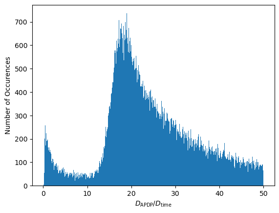
Interesting... There appear to be two distinct modes in this distribution. These modes can be attributed to behaviors of the transmitter:
- The transmitter might be moving with more or less constant speed. In that case, we land on the right mode, i.e., \( \mathbf D_{\mathrm{ADP}, i, j} \) is large compared to \( \mathbf D_{\mathrm{time}, i, j} \).
- Or, the transmitter may be static or just rotating. This occurs more rarely. In that case, \( \mathbf D_{\mathrm{ADP}, i, j} \) is small and we land on the left mode.
This motivates a simple dissimilarity matrix fusing algorithm:
- First, we find the value \( \gamma \) which separates the two modes of \( \mathcal R \). We use \( \gamma \) as a scaling factor.
- For each matrix entry \( i, j \in 1, \ldots, L \), we compare \( \gamma \mathbf D_{\mathrm{time}, i, j} \) to \( \mathbf D_{\mathrm{ADP}, i, j} \). We assume that whichever is smaller, is more accurate. Visually speaking, if \( i, j \) belongs to the left mode in \( \mathcal R \), we use \( \mathbf D_{\mathrm{ADP}, i, j} \), otherwise, we use \( \gamma \mathbf D_{\mathrm{time}, i, j} \).
For separating the two modes, we could use some kind of thresholding algorithm. In the Python code, we will use a very primitive approach which finds the leftmost point of the right mode:
bin_centers = edges[:-1] + np.diff(edges) / 2.
max_bin = np.argmax(occurences)
min_threshold = np.quantile(occurences[:max_bin], 0.5)

for threshold_bin in range(max_bin - 1, -1, -1):
	if occurences[threshold_bin] < min_threshold:
		break

scaling_factor = bin_centers[threshold_bin]

plt.bar(bin_centers[:max_bin], occurences[:max_bin], width = edges[1] - edges[0])
plt.axhline(y = min_threshold, color = 'r', linestyle = '-')
plt.text(4, min_threshold + 10, "Mode Separation Threshold", color = 'r',)
plt.axvline(x = scaling_factor, color = 'r', linestyle = '-')
plt.xlabel("$D_\mathrm{APDP} / D_\mathrm{time}$")
plt.ylabel("Number of Occurences")
plt.show()

print("gamma = ", scaling_factor)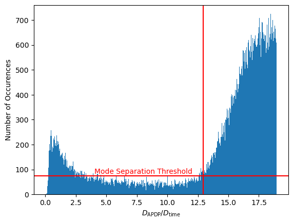
gamma = 12.916666507720947Finally, we can fuse the two dissimilarity matrices:
# Fuse ADP-based and time-based dissimilarity matrices
dissimilarity_matrix_fused = np.minimum(adp_dissimilarity_matrix, timestamp_dissimilarity_matrix * scaling_factor)
Admittedly, this kind of heuristic is very much dataset-dependent. In a different dataset, we might have a mix of transmitters (stationary, pedestrian, car) moving at different speeds. In that case we would need a more advanced heuristic that, for example, estimates the transmitter-specific speed based on CSI data, or we might want to use an entirely different fusing approach. In some cases, we might want to use a nonlinear scaling to match the two dissimilarity metrics, or we might want to choose the more accurate dissimilarity not just based on which entry is smaller.
Step 4: Geodesic Dissimilarity Matrix
The importance of using geodesic dissimilarities was highlighted in a paper by a group at Fraunhofer IIS. In our exemplary dissimilarity matrix of train travel times above, we were unable to tell how much time it would take to get from Stuttgart to Brussels, since there is no direct train connection between these two cities. However, we can get an estimate for the required travel time (ignoring transfer time), by summing up the time it takes to go from Stuttgart to Frankfurt and the time it takes to travel from Frankfurt to Brussels. Why don't we go from Stuttgart to Brussel's via Paris? Well, because, according to our travel times, the route via Frankfurt is shorter: To figure out the missing dissimilarity, we applied a shortest path algorithm.

n_neighbors = 20

nbrs_alg = NearestNeighbors(n_neighbors = n_neighbors, metric="precomputed", n_jobs = -1)
nbrs = nbrs_alg.fit(dissimilarity_matrix_fused)
nbg = kneighbors_graph(nbrs, n_neighbors, metric = "precomputed", mode="distance")dissimilarity_matrix_geodesic = np.zeros((nbg.shape[0], nbg.shape[1]), dtype = np.float32)
def shortest_path_worker(todo_queue, output_queue):
while True:
index = todo_queue.get()
if index == -1:
output_queue.put((-1, None))
break
d = dijkstra(nbg, directed=False, indices=index)
output_queue.put((index, d))
with tqdm(total = nbg.shape[0]**2) as pbar:
todo_queue = mp.Queue()
output_queue = mp.Queue()
for i in range(nbg.shape[0]):
todo_queue.put(i)
for i in range(mp.cpu_count()):
todo_queue.put(-1)
p = mp.Process(target = shortest_path_worker, args = (todo_queue, output_queue))
p.start()
finished_processes = 0
while finished_processes != mp.cpu_count():
i, d = output_queue.get()
if i == -1:
finished_processes = finished_processes + 1
else:
dissimilarity_matrix_geodesic[i,:] = d
pbar.update(len(d))This is one of the most complex processing steps in the Channel Charting pipeline. Regardless, on a modern machine, it should only take a few minutes at maximum. Again, we can visualize the dissimilarity matrix in a video. The resulting fused, geodesic dissimilarity matrix is clearly much better than the purely ADP-based one.
While these videos are a great visualization, there is a more scientific method to evaluate the quality of a dissimilarity metric. This paper introduced a diagram that relates the dissimilarities it to the ground truth Euclidean distances. Let's compare \( \mathbf D_\mathrm{ADP} \) to \( \mathbf D_\mathrm{G-fuse} \) this way.
For this, we first need to compute the true distance matrix, i.e., the Euclidean distances between the ground truth positions:
# Compute distances between groundtruth positions
groundtruth_distance_matrix = distance_matrix(groundtruth_positions, groundtruth_positions)def plot_dissimilarity_over_euclidean_distance(dissimilarity_matrix, distance_matrix, label = None):
nth_reduction = 10
dissimilarities_flat = dissimilarity_matrix[::nth_reduction, ::nth_reduction].flatten()
distances_flat = distance_matrix[::nth_reduction, ::nth_reduction].flatten()
max_distance = np.max(distances_flat)
bins = np.linspace(0, max_distance, 200)
bin_indices = np.digitize(distances_flat, bins)
bin_medians = np.zeros(len(bins) - 1)
bin_25_perc = np.zeros(len(bins) - 1)
bin_75_perc = np.zeros(len(bins) - 1)
for i in range(1, len(bins)):
bin_values = dissimilarities_flat[bin_indices == i]
bin_25_perc[i - 1], bin_medians[i - 1], bin_75_perc[i - 1] = np.percentile(bin_values, [25, 50, 75])
plt.plot(bins[:-1], bin_medians, label = label)
plt.fill_between(bins[:-1], bin_25_perc, bin_75_perc, alpha=0.5)
plt.figure(figsize=(8,4))
plot_dissimilarity_over_euclidean_distance(dissimilarity_matrix_geodesic, groundtruth_distance_matrix, "G-fuse")
plot_dissimilarity_over_euclidean_distance(scaling_factor * adp_dissimilarity_matrix, groundtruth_distance_matrix, "ADP")
plt.legend()
plt.xlabel("Euclidean Distance [m]")
plt.ylabel("Scaled Dissimilarity")
plt.show()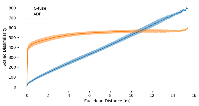
Manifold Learning: Finding the Low-Dimensional Representation

Channel Charting is essentially a special case of manifold learning, where we try to find a low-dimensional representation (physical coordinates) of the manifold of datapoints that lives in high-dimensional CSI space. There are multiple well-known manifold learning techniques, which can be categorized into two classes: Classical techniques and Deep Learning-based technqiues.
Both classes of techniques are suitable for Channel Charting, and can produce equally good channel charts. The advantage of deep learning-based Channel Charting is that it can easily process previously unseen datapoints (it's a parametric method), more on that later.
The First Channel Chart: MDS / Isomap
Time to generate the first channel chart! We will use the classical multidimensional scaling (MDS) manifold learning technique. MDS optimizes the cost function \[ \min_{\{\mathbf{z}^{(l)}\}_{l=1}^L} \sum\nolimits_{i=1}^{L-1}\sum\nolimits_{j=i+1}^L \left(\mathbf D_{\mathrm{G-fuse}, i, j} - \lVert \mathbf{z}^{(i)} - \mathbf{z}^{(j)} \rVert_2 \right)^2 \] using gradient descent, where \( \mathbf z^{(l)} \in \mathbb R^2 \) are the locations of points in the channel chart (we always assume 2-dimensional channel charts). We only need to provide the dissimilarity matrix to get a chart, easy 🙂! If MDS is used in conjunction with a geodesic dissimilarity matrix, it is also known as Isomap. In our code, we will only plot every 10th datapoint in the channel chart (since MDS can be pretty slow). Also, we cap the number of gradient descent iterations at 80:
nth_reduction = 10

reduced_dissimilarity_matrix_geodesic = dissimilarity_matrix_geodesic[::nth_reduction, ::nth_reduction]
embedding_isomap = MDS(metric = True, dissimilarity = 'precomputed', max_iter = 80, normalized_stress = False)
proj_isomap = embedding_isomap.fit_transform(reduced_dissimilarity_matrix_geodesic)
plot_colorized(proj_isomap, groundtruth_positions[::nth_reduction], title = "Isomap Channel Chart")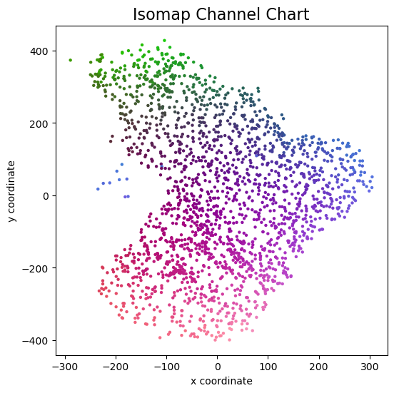
And this is the channel chart that we get! This already very much resembles the ground truth top view map from above, except for some arbitrary rotation / flipping and scaling of course.
But what if the base station now measures an additional datapoint and we want to localize the user on the channel chart, what would we have to do? This is the main downside of classical, so called non-parametric Channel Charting methods: We need to start the whole process from the very beginning, compute the dissimilarity of the new datapoint to all existing ones, re-run the shortest path algorithm and also re-run MDS. Obviously, this is unfeasible for practical applications.
The ability to map previously unseen CSI data to the channel chart is why deep learning-based Channel Charting is favored over classical methods.
Deep Learning-Based Channel Charting: The Forward Charting Function
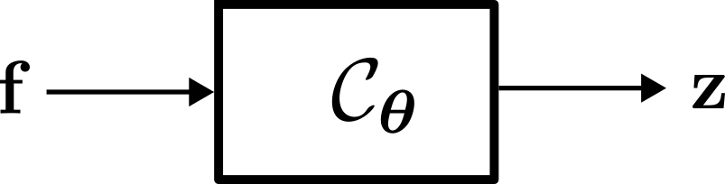
Regardless of the training method employed, the objective of neural network-based Channel Charting is to learn the so-called Forward Charting Function (FCF) \( \mathcal C_{\boldsymbol \theta} \). The FCF takes a feature vector \( \mathbf f \) as an input and directly outputs the position in the channel chart \( \mathbf z \). Once \( \mathcal C_{\boldsymbol \theta} \) has been found, this makes it very easy and efficient to infer additional chart positions (unlike with MDS).
The \( \boldsymbol \theta \) in the subscript indicates that this function is parametrized by a parameter vector \( \boldsymbol \theta \), which contains the weights and biases of the neural network (hence, deep learning-based Channel Charting is parametric). The purpose of neural network training is to find suitable values for \( \boldsymbol \theta \).
Feature Engineering
Naively, one might just want to provide the time-domain CSI tensors \( \mathbf {\hat H}^{(l)} \) as inputs to the neural network. That would not work for two reasons:- \( \mathbf {\hat H}^{(l)} \) is complex-valued and (at least, currently) TensorFlow neural networks work with real numbers
- Channel coefficient phases are relative. Since transmitter and receiver oscillators are not perfectly synchronized (and in the real world they won't be, unless you have atomic clocks or highly accurate GPSDOs on both ends), the global phase rotation in \( \mathbf {\hat H}^{(l)} \) changes over time. Even if the transmitter remains at the same position and the environment is perfectly static, the receiver may measure \( \mathbf {\hat H}^{(l)} \) at one point in time, and \( \mathrm e^{j \varphi} \cdot \mathbf {\hat H}^{(l)} \) soon after. Neural networks are not well-equipped to compensate for this phase rotation.
In practical terms, we can implement the feature engineering stage as a Keras layer. This means we can actually feed \( \mathbf {\hat H}^{(l)} \) as an input to that layer, and the layer will blow this up to \( \mathbf{f}^{(l)} \). The computation of the sample correlations can again be implemented using TensorFlow's einsum (with the advantage that feature engineering can be efficiently performed on the GPU).
class FeatureEngineeringLayer(tf.keras.layers.Layer):
	def __init__(self):
		super(FeatureEngineeringLayer, self).__init__(dtype = tf.complex64)

	def call(self, csi):
		# Compute sample correlations for any combination of two antennas in the whole system
		# for the same datapoint and time tap.
		sample_autocorrelations = tf.einsum("damt,dbnt->dtabmn", csi, tf.math.conj(csi))
		return tf.stack([tf.math.real(sample_autocorrelations), tf.math.imag(sample_autocorrelations)], axis = -1)
The Forward Charting Function: Defining the Neural Network
Next, we can define the actual neural network that implements the FCF \( \mathcal C_{\boldsymbol \theta} \). There is really not that much to see here, it is just a dense network. We have a couple of hidden layers with ReLU activation, an output layer with linear activation and we use batch normalization.
array_count = np.shape(csi_time_domain)[1]
antenna_per_array_count = np.shape(csi_time_domain)[2]
tap_count = np.shape(csi_time_domain)[3]

cc_embmodel_input = tf.keras.Input(shape=(array_count, antenna_per_array_count, tap_count), name="input", dtype = tf.complex64)
cc_embmodel_output = FeatureEngineeringLayer()(cc_embmodel_input)
cc_embmodel_output = tf.keras.layers.Flatten()(cc_embmodel_output)
cc_embmodel_output = tf.keras.layers.Dense(1024, activation = "relu")(cc_embmodel_output)
cc_embmodel_output = tf.keras.layers.BatchNormalization()(cc_embmodel_output)
cc_embmodel_output = tf.keras.layers.Dense(512, activation = "relu")(cc_embmodel_output)
cc_embmodel_output = tf.keras.layers.BatchNormalization()(cc_embmodel_output)
cc_embmodel_output = tf.keras.layers.Dense(256, activation = "relu")(cc_embmodel_output)
cc_embmodel_output = tf.keras.layers.BatchNormalization()(cc_embmodel_output)
cc_embmodel_output = tf.keras.layers.Dense(128, activation = "relu")(cc_embmodel_output)
cc_embmodel_output = tf.keras.layers.BatchNormalization()(cc_embmodel_output)
cc_embmodel_output = tf.keras.layers.Dense(64, activation = "relu")(cc_embmodel_output)
cc_embmodel_output = tf.keras.layers.BatchNormalization()(cc_embmodel_output)
cc_embmodel_output = tf.keras.layers.Dense(2, activation = "linear")(cc_embmodel_output)

cc_embmodel = tf.keras.Model(inputs=cc_embmodel_input, outputs=cc_embmodel_output, name = "ForwardChartingFunction")
Siamese Neural Network

Remember, we can't train the FCF in a supervised manner, since we don't have ground truth information. However, we do have a dissimilarity matrix \( \mathbf D_\mathrm{G-fuse} \) and we could try to make the FCF map datapoints to the channel chart such that the channel chart positions conform to \( \mathbf D_\mathrm{G-fuse} \). This is exactly the idea of a Siamese Neural Network: Run the FCF twice on two different datapoint feature vectors \( \mathbf f^{(i)} \) and \( \mathbf f^{(j)} \), and tune (via backpropagation) the neural network based on how well the produced channel chart positions \( \mathbf z^{(i)} \) and \( \mathbf z^{(j)} \) match the dissimilarity matrix.
This allows us to reuse the MDS cost function as a loss function for the Siamese neural network (where \( N \) is the size of the current batch): \[ \mathcal{L}_\mathrm{Siamese} = \frac{1}{N^2} \sum\nolimits_{i=1}^{N}\sum\nolimits_{j=1}^N \left(\mathbf D_{\mathrm{G-fuse}, i, j}-\Vert\mathbf{z}^{(i)}-\mathbf{z}^{(j)}\Vert_2\right)^2. \]
dissimilarity_margin = np.quantile(dissimilarity_matrix_geodesic, 0.01)

def siamese_loss(y_true, y_pred):
	y_true = tf.reshape(y_true, (-1,))
	pos_A, pos_B = (y_pred[:,:2], y_pred[:,2:])
	distances_pred = tf.math.sqrt(tf.math.reduce_sum(tf.square(pos_A - pos_B), axis = 1))

return tf.reduce_mean(tf.square(distances_pred - y_true) / (y_true + dissimilarity_margin))input_A = tf.keras.layers.Input(shape = (array_count, antenna_per_array_count, tap_count,), dtype = tf.complex64)
input_B = tf.keras.layers.Input(shape = (array_count, antenna_per_array_count, tap_count,), dtype = tf.complex64)
embedding_A = cc_embmodel(input_A)
embedding_B = cc_embmodel(input_B)
output = tf.keras.layers.concatenate([embedding_A, embedding_B], axis=1)
model = tf.keras.models.Model([input_A, input_B], output, name = "SiameseNeuralNetwork")Sample Selection
We generate a dataset calledrandom_pair_dataset, which, as the name suggests, contains random pairs of CSI tensors \( \mathbf { \hat H}^{(i)} \), \( \mathbf { \hat H}^{(j)} \) from our dataset.
It is a good idea to implement this sample selection in a way that allows TensorFlow to optimize for maximum performance.
csi_time_domain_tensor = tf.constant(csi_time_domain)
dissimilarity_matrix_geodesic_tensor = tf.constant(dissimilarity_matrix_geodesic)

datapoint_count = tf.shape(csi_time_domain_tensor)[0].numpy()

random_integer_pairs_dataset = tf.data.Dataset.zip(tf.data.Dataset.random(), tf.data.Dataset.random())

@tf.function
def fill_pairs(randA, randB):
    return (csi_time_domain_tensor[randA % datapoint_count], csi_time_domain_tensor[randB % datapoint_count]), dissimilarity_matrix_geodesic_tensor[randA % datapoint_count, randB % datapoint_count]

random_pair_dataset = random_integer_pairs_dataset.map(fill_pairs)
Training
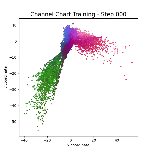
Finally, we can start the neural network training. With a modern GPU, you should see the first channel chart after a few seconds, and training should be finished after a couple of minutes. We adapt the learning rates and batch sizes over the training epochs (note: epochs don't really make sense in this context, so we will use the words epoch and session interchangeably), such that the FCF first learns the coarse, global structure of the channel chart and later focuses on the finer details.optimizer = tf.keras.optimizers.Adam()
model.compile(loss = siamese_loss, optimizer = optimizer)
samples_per_session = 150000
learning_rates = [1e-2, 1e-2, 8e-3, 4e-3, 1e-3, 5e-4, 2e-4, 1e-4]
batch_size = [500, 1000, 1500, 2000, 3000, 4000, 5000, 6000]
for l in range(len(learning_rates)):
print("\nTraining Session ", l + 1, "\nBatch Size: ", batch_size[l], "\nLearning rate: ", learning_rates[l])
# Fit model
optimizer.learning_rate.assign(learning_rates[l])
model.fit(random_pair_dataset.batch(batch_size[l]).prefetch(tf.data.AUTOTUNE), steps_per_epoch = samples_per_session // batch_size[l])
# Plot Channel Chart
print("Running inference to plot channel chart")
channel_chart_positions = cc_embmodel.predict(csi_time_domain)
plot_colorized(channel_chart_positions, groundtruth_positions, title = "Siamese-Based Channel Chart - Session " + str(l + 1))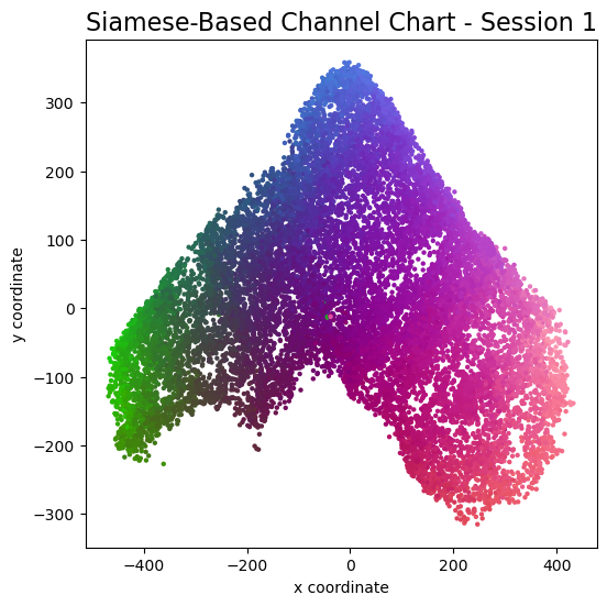
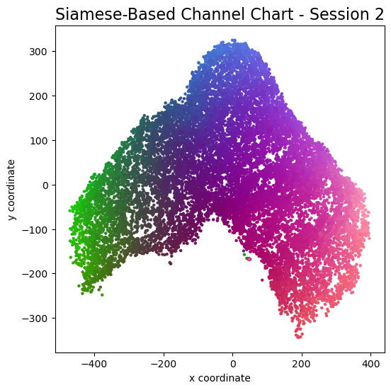
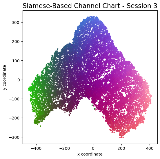
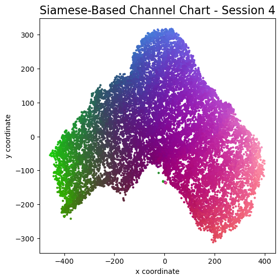


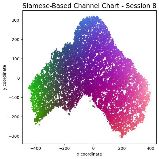
Channel charts like these ones (use the arrows to look at different training sessions) should show up very soon. The L-shaped structure of the measurement area that is also visible in the top view of "ground truth" positions is clearly very well preserved here.
Actually, the channel chart that appears after the first training epoch is already pretty acceptable, the global structure is clearly visible.
As always, there is some unknown rotation / flipping / scaling between the channel chart and the true locations.
Evaluation: Optimal Affine Transform and Mean Absolute Error
To get a nice side-by-side comparison between channel chart and ground truth positions, we want to find the optimal affine transform \[ \mathbf {\hat z}^{(l)} = \mathbf {\hat A} \mathbf z^{(l)} + \mathbf { \hat b } \] from channel chart coordinates \( \mathbf z^{(l)} \) to real-world coordinates \( \mathbf {\hat z}^{(l)} \), where \( \mathbf {\hat A} \in \mathbb R^{2 \times 2} \) and \( \mathbf { \hat b} \in \mathbb R^2 \) (2-dimensional space). Channel Charting in real-world coordinates is a topic on its own, that we don't want to get into here. Some previous research (for example, S. Taner et al, J. Pihlajasalo et al) has been published on this topic. For the purpose of this tutorial, we will "cheat" by using ground truth information to find \( \mathbf {\hat A} \) and \( \mathbf {\hat b} \). Regardless, we belive that, if BS antenna locations are known, fully self-supervised Channel Charting in real world coordinates will become possible in the near future (after all, it's just a matter figuring out optimal values for four entries in \( \mathbf {\hat A} \) and two entries in \( \mathbf {\hat b} \)).
Using the ground truth positions \( \mathbf x^{(l)} \), we can find the optimal affine transform by solving the least-squares problem \[ (\mathbf{\hat A}, \mathbf{\hat b}) = \underset{(\mathbf{A}, \mathbf{b})}{\mathrm{argmin}} \sum_{l = 1}^L \lVert\mathbf{A}\mathbf{z}^{(l)} + \mathbf b - \mathbf{x}^{(l)}\rVert_2^2. \] We implement the solution to this problem with an augmented transformation matrix that handles both linear transformations and translations, and using NumPy's linalg.lstsq:channel_chart_positions = cc_embmodel.predict(csi_time_domain)
def affine_transform_channel_chart(groundtruth_pos, channel_chart_pos):
pad = lambda x: np.hstack([x, np.ones((x.shape[0], 1))])
unpad = lambda x: x[:,:-1]
A, res, rank, s = np.linalg.lstsq(pad(channel_chart_pos), pad(groundtruth_pos), rcond = None)
transform = lambda x: unpad(np.dot(pad(x), A))
return transform(channel_chart_pos)
channel_chart_positions_transformed = affine_transform_channel_chart(groundtruth_positions, channel_chart_positions)
plot_colorized(groundtruth_positions, groundtruth_positions, title = "Ground Truth Positions")
plot_colorized(channel_chart_positions_transformed, groundtruth_positions, title = "Channel Chart After Affine Transform")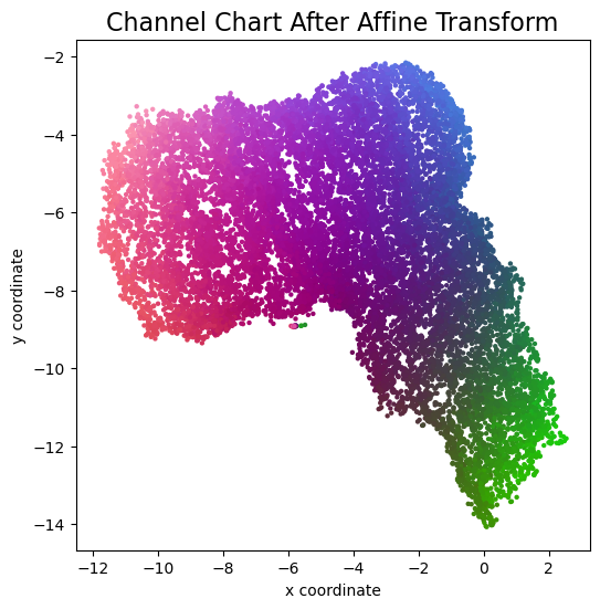
errorvectors = groundtruth_positions - channel_chart_positions_transformed
errors = np.sqrt(errorvectors[:,0]**2 + errorvectors[:,1]**2)
mae = np.mean(errors)

nth_errorvector = 15
plot_colorized(channel_chart_positions_transformed, groundtruth_positions, title = "Error Vectors, MAE = " + str(mae) + "m", show = False, alpha = 0.3)
plt.quiver(channel_chart_positions_transformed[::nth_errorvector, 0], channel_chart_positions_transformed[::nth_errorvector, 1], errorvectors[::nth_errorvector, 0], errorvectors[::nth_errorvector, 1], color = "black", angles = "xy", scale_units = "xy", scale = 1)
plt.show()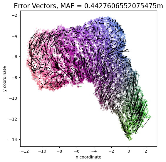
count, bins_count = np.histogram(errors, bins=200)
pdf = count / sum(count)
cdf = np.cumsum(pdf)

bins_count[0] = 0
cdf = np.append([0], cdf)

plt.figure(figsize=(5, 4))
plt.plot(bins_count, cdf)
plt.xlim((0, 2))
plt.xlabel("Absolute Localization Error [m]")
plt.ylabel("CDF")
plt.grid()
plt.show()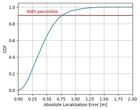
Evaluation: Continuity, Trustworthiness, Kruskal's Stress
Channel Channel literature (and, more general, manifold learning literature) likes to evaluate channel charts not based on some absolute error values, but using some performance metrics specifically designed for dimensionality reduction. These metrics are invariant to the unpredictable rotations and scalings that are inherent to unsupervised dimensionality reduction. The most commonly used metrics are:- Continuity (CT) and Trustworthiness (TW), both normalized to range \( [0, 1] \), which are two measures for the preservation of local neighborhoods. A high CT indicates that many neighborhood relationships in physical space are preserved in the channel chart. A high TW value, on the other hand, indicates that the channel chart does not contain many additional false neighborhood relationships, i.e., ones which are not present in the physical space. Trustworthiness (and, by swapping parameters, continuity) is already implemented in the scikit-learn package.
- Kruskal's Stress (KS) is a measure for the preservation of the global channel chart structure. It is also bounded to the range \( [0,1] \), but this time with 0 indicating the best and 1 indicating the worst possible performance.
# Continuity is identical to trustworthiness, except that original space and embedding space are swapped
def continuity(*args, **kwargs):
	args = list(args)
	args[0], args[1] = args[1], args[0]
	return trustworthiness(*args, **kwargs)

def kruskal_stress(X, X_embedded):
	dist_X = distance_matrix(X, X)
	dist_X_embedded = distance_matrix(X_embedded, X_embedded)
	beta = np.divide(np.sum(dist_X * dist_X_embedded), np.sum(dist_X_embedded * dist_X_embedded))

return np.sqrt(np.divide(np.sum(np.square((dist_X - beta * dist_X_embedded))), np.sum(dist_X * dist_X)))# Evaluate CT / TW / KS on a subset of the whole dataset
subset_indices = random.sample(range(len(groundtruth_positions)), len(groundtruth_positions) // 5)
groundtruth_positions_subset = groundtruth_positions[subset_indices]
channel_chart_positions_subset = channel_chart_positions[subset_indices]
ct = continuity(groundtruth_positions_subset, channel_chart_positions_subset, n_neighbors = int(0.05 * len(groundtruth_positions_subset)))
tw = trustworthiness(groundtruth_positions_subset, channel_chart_positions_subset, n_neighbors = int(0.05 * len(groundtruth_positions_subset)))
ks = kruskal_stress(groundtruth_positions_subset, channel_chart_positions_subset)
print("CT: {} \nTW: {} \nKS: {}".format(*np.around((ct, tw, ks), 5)))| Continuity (CT) | 0.9960 |
|---|---|
| Trustworthiness (TW) | 0.9962 |
| Kruskal's Stress (KS) | 0.0845 |
Augmented Channel Charting: Absolute Localization
Channel Charting is not just a wireless source localization technique, but wireless source localization is one of its applications. When we use Channel Charting for localization, we want to obtain transmitter position coordingates in some absolute coordinate frame. The good news is: If we know the location of the receiver antenna arrays, we can achieve this by combining Channel Charting with classical wireless source localization techniques. Classical wireless localization techniques typically rely on angle of arrival (AoA) estimation and subsequent triangulation, or time of arrival (ToA) estimation and subsequent multilateration, or a combination of both. In a framework that we call augmented Channel Charting, we feed these classical position estimates to the neural network during training.
The result: A forward charting function that can localize UEs in the absolute coordinate frame, and, by exploiting information contained in the multipath characteristics of the channel, is more accurate than classical approaches.

A Note on Privacy
Last, but not least: If you read the whole tutorial all the way to the end, then you have certainly realized that Channel Charting technology means that the massive MIMO base station will know the location of the users in a much more fine-grained manner than is possible with today's base stations and their sector antennas. In my experience, Channel Charting researchers are very aware of the potential privacy implications. There are some very obvious benefits attached to Channel Charting (outlined in the introduction), but there is also potential for abuse. With all the skepticism about 5G and mobile networks in general, we believe it is important to transparently publish and discuss the advantages and risks of this technology.
Licensing and Authors
All our datasets are licensed under the CC-BY license, i.e., you are free to use them for whatever you like as long as you reference us in your publications. All code in this tutorial is CC0-licensed. This tutorial was written by Florian Euchner, with contributions by Chae Eun Lee and Phillip Stephan.